


This project could have been filed under "We are going another direction," but I liked it enough to give it its own space. This was for the public library in Los Alamos, California. Its resurrection was my mother-in-law's pet project. When I think of libraries, I am reminded of those bluish-purple ink pads. I tried to incorporate that into the design aesthetic.
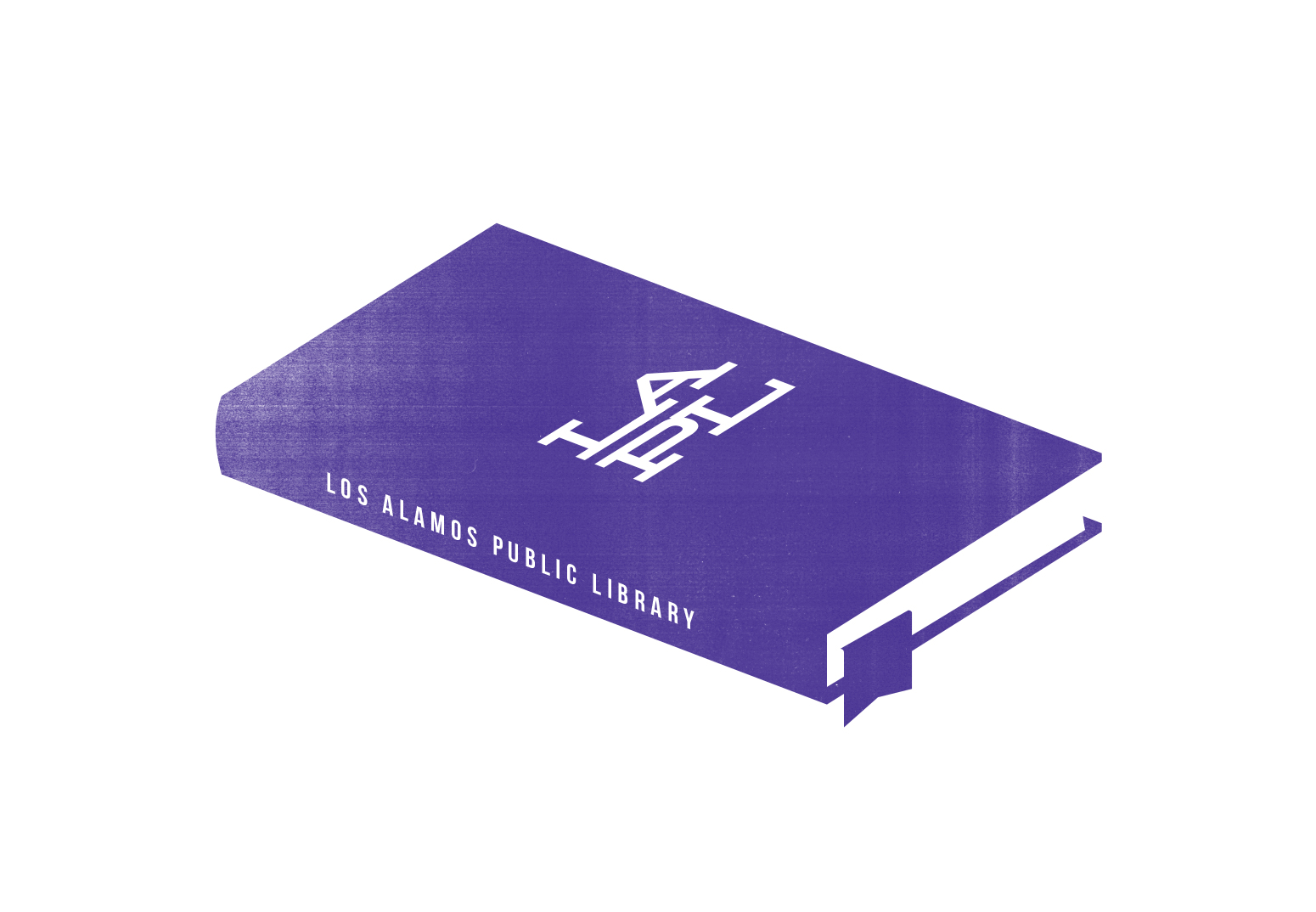
Secondary logo. Or Primary. I think I like it better.

They could get actual stamps made, then marked their property (and letterheads, etc.) with them.
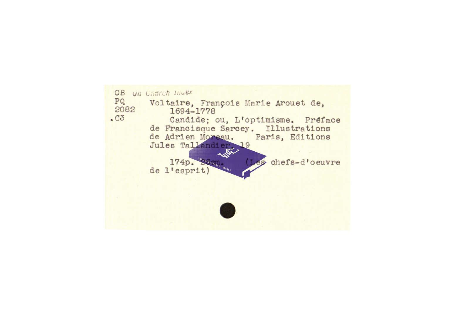
I wanted them to use old cards from their card catalog as notecards.

Here's how they'd look in black/two-color.